Designing for Social Media: High-Impact Visuals for U.S. Brands
Designing visuals for social media in the U.S. market is less about decoration and more about fast communication, cultural nuance, and consistent brand memory. Feeds move at high speed; a post has a fraction of a second to earn a pause, a like, a tap, or a share. High-impact visuals align three elements: clear business goals, platform-native design, and a deep understanding of your American audience and context.
Below is a structured approach to designing visuals that perform for U.S. brands across social platforms.
1. Start with Strategy, Not Aesthetics
Before colors and layouts, define:
- Objective: Awareness, engagement, clicks, sign-ups, sales, or consideration?
- Action: What exactly should users do after seeing the visual?
- Audience specifics: Age, interests, location, values, pain points, device usage.
- Brand position: Premium vs budget, playful vs serious, mass vs niche.
Tie each visual to a measurable outcome:
- Awareness → reach, impressions, video completion rate
- Engagement → saves, shares, comments, profile visits
- Performance → click-through rate, conversions, cost-per-result
Every design decision should support this outcome. A clever layout that reduces legibility or confuses the call to action is bad design, even if it looks beautiful.
2. Design for the Platform, Not the Portfolio
Each social network in the U.S. has its own visual language, content velocity, and user expectations.
- Feed posts:
- Aspect ratios: 1:1 and 4:5 are standards.
- Use bold focal points and minimal text overlay; users quickly scroll.
- Carousels perform well for storytelling, tutorials, and before/after sequences.
- Reels (9:16 vertical):
- Design with safe zones: keep essential text and logos away from the very top/bottom where UI elements sit.
- Use large, high-contrast text for hooks in the first 2–3 seconds.
- Native typography and stickers often outperform overly “polished” graphics.
- Stories:
- Think full-screen, immersive vertical experiences.
- Add interactive elements: polls, quizzes, sliders, links (if available).
- Simpler compositions; legible at arm’s length on a small phone screen.
TikTok
- Native video language: fast cuts, captions, lo-fi authenticity.
- Use subtitles/captions—most users watch with sound, but captions help with comprehension and accessibility.
- Visuals should feel creator-first, brand-second; polished, “TV-style” design often underperforms.
- On-screen text must be short, witty, and synced with audio.
- Mix of image, link previews, and video.
- Older demographics in the U.S. mean slightly longer attention spans and more willingness to read.
- Clear product visuals and benefits perform well; think straightforward rather than hyper-stylized.
X (Twitter)
- Visuals must support short text posts:
- Simple charts, quote cards, product snapshots.
- High-contrast images that read well at small thumbnail size.
- Keep text overlays ultra-short—headlines, key stats, punchlines.
- Professional, credibility-focused imagery:
- Data visualizations, clean mockups, expert quotes.
- Minimalist design, restrained palettes, clear hierarchy.
- Avoid meme-style visuals unless the brand is intentionally informal.
- 2:3 vertical pins, with a strong central subject.
- Text overlays should emphasize outcomes: “How to…,” “5 Ways to…,” “Checklist for…”.
- Highly aspirational, polished, and evergreen designs perform better than trend-chasing content.
YouTube (Thumbnails & Shorts)
- Thumbnails:
- Overstated expressions, clear focal subject, large title text.
- Strong color contrast; avoid clutter.
- Shorts:
- Similar to TikTok styling; ensure branding is subtle yet present (consistent colors, type, or corner logo).
3. Visual Hierarchy and Scannability
High-impact social visuals respect how people actually view a screen:
- Grab attention: A bold focal point (object, person, or word).
- Orient quickly: Who is speaking (logo/brand cues) and what this is about (title or visual context).
- Invite action: A clear CTA, even if implicit (e.g., “Swipe to see…” or “Tap to shop”).
Key principles:
- One idea per visual
Avoid competing headlines, multiple offers, or too many calls to action.
- Clear hierarchy
Establish a visual order:- Primary: hook or main message
- Secondary: supporting detail (e.g., benefit or proof)
- Tertiary: branding and CTA
- Whitespace
U.S. feeds are visually noisy. Clean layouts with breathing room feel premium and are more readable.
4. Typography That Works on Tiny Screens
Most social media is consumed on phones, often in suboptimal conditions (sunlight, motion, multitasking).
- Font choice:
- Use 1–2 typefaces max (primary + maybe accent).
- Stick to highly legible sans-serifs for small text.
- Avoid overly thin weights or highly decorative fonts for key information.
- Size & contrast:
- Design at native size (e.g., 1080×1920) and zoom out to 25–50% to test readability.
- Ensure strong contrast: dark text on light backgrounds or light on dark; avoid text on high-detail photos unless using overlays.
- Hierarchy with type:
- Use weight, size, and color to distinguish headings from body.
- Avoid using too many different text treatments (outlines, shadows, gradients) at the same time; they quickly look cheap or cluttered.
- Cultural sensitivity in wording:
- U.S. audiences are sensitive to loaded terms around identity, health, money, and politics.
- Avoid clichés that can feel stereotypical or dismissive.
- When in doubt, use plain, respectful language.
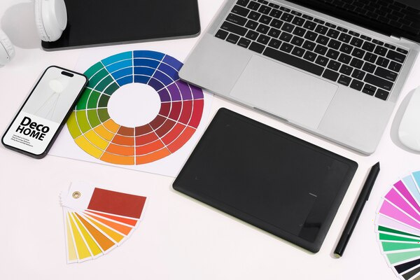
5. Color Palettes for Impact and Recognition
Color should work both for attention and for brand recognition.
- Brand core palette:
- Define 2–3 primary brand colors and 2–3 neutrals.
- Use them consistently across platforms for easy mental linking.
- Contrast & accessibility:
- Aim for AA-level contrast for text over backgrounds where possible.
- Test common combinations (e.g., red text on black) on mobile screens.
- Platform and context awareness:
- Dark mode is common across apps; overly subtle, low-contrast visuals can vanish.
- Ensure visual impact against both light and dark UI backgrounds.
- Emotional fit for U.S. audiences:
- Blues, greens → trust, calm, professionalism.
- Reds, oranges → urgency, action, excitement.
- Pastels, muted tones → lifestyle, wellness, minimalist aesthetics.
- For U.S. holidays (Fourth of July, Memorial Day, Labor Day), be thoughtful using patriotic palettes; avoid trivializing serious occasions.
6. Imagery, Representation, and Cultural Nuance
For U.S. brands, visual representation and cultural context are business-critical, not just ethical.
- Diverse representation:
- Reflect the actual diversity of the U.S.: race, age, body types, abilities, family structures.
- Avoid tokenism—make diversity consistent, not only in “campaign” posts.
- Ensure people are portrayed with dignity and authenticity, not stereotypes.
- Cultural awareness:
- Double-check references around major cultural and religious holidays.
- Be careful with humor that might read differently across regions or demographics.
- Avoid visual jokes rooted in negative stereotypes (e.g., about income, education, or region).
- Authenticity vs stockish look:
- High-quality user-generated style content (UGC) often outperforms staged stock photos.
- If you must use stock imagery, choose photos that feel candid, with believable settings and expressions.
- Ethics and sensitivity:
- When touching on topics like health, mental health, or social issues, use clear disclaimers and respectful visuals.
- Avoid “shock” imagery that exploits pain or fear for attention.
7. Brand Systems for Social: Templates and Components
To stay consistent at the volume social demands, brands need reusable visual systems.
- Template sets:
- Create templates for:
- Announcements
- Promotions/discounts
- Educational posts (tips, how-tos)
- Testimonials/reviews
- Quotes and thought leadership
- Carousels/step-by-step guides
- Include defined styles for cover slide, inner slides, and final CTA slide.
- Components:
- Logo lockups (corner placements, watermark styles)
- Social handles and URLs
- CTA buttons/chips (“Shop now,” “Learn more”)
- Branded shapes, lines, icons
- Guidelines:
- Simple documentation: what to do and what to avoid (font sizes, safe zones, max text length, image treatments).
- This keeps multiple creators (internal and external) aligned.
8. Designing for Performance and Conversion
Visual appeal is just the starting point; performance is the real metric.
- Clear CTA integration:
- For paid ads, design with the platform’s CTA button in mind (e.g., “Shop Now” on Meta); your visual should support, not fight, that button.
- Use directional cues: gaze direction, arrows, or layout flow that naturally leads to the CTA.
- Highlight benefits, not just features:
- Transform product attributes into outcomes:
- “4K Camera” → “Crisp videos even in low light”
- “Organic ingredients” → “Cleaner snacks you can feel good about”
- Use visuals that literally show the benefit (before/after, side-by-side, context-of-use scenes).
- Mobile-first detail level:
- Avoid cramming tiny feature lists; use multiple assets in a carousel or sequenced stories.
- One benefit per panel often works better than all-in-one visuals.
- Trust signals:
- Incorporate ratings, badges (“4.8 ★ on 5,000+ reviews”), quick quotes, or recognizable partner logos (where allowed).
- Use them as visual elements, not as small fine print.
9. Motion, Video, and Micro-Animations
Static images can work, but motion is increasingly favored by algorithms and users.
- Use motion strategically:
- Opening 1–2 seconds: a visual hook (pattern break, unexpected motion, bold title, or strong face).
- Keep transitions purposeful; avoid gratuitous effects that slow the message.
- Use subtle UI-like animations (hover effects, loading bars) to signal interactivity.
- Text in motion:
- Caption key spoken lines on-screen for clarity and silent viewing.
- On-screen text should appear long enough to read twice.
- Loops and satisfying endings:
- Smooth loops increase watch time, especially in Reels, TikTok, and Shorts.
- Visually satisfying sequences (clean cuts, reveals, “after” shots) are highly shareable.
10. Testing, Learning, and Localizing for the U.S.
High-impact visuals emerge from iteration, not guesswork.
- A/B testing creative:
- Test small variations:
- Different hero image (product vs human)
- Headline phrasing
- Background color
- CTA placement
- Run tests by audience segment (age, interest, geography) where possible.
- Data-informed refinement:
- Analyze:
- Hook performance (first 3 seconds in video)
- Drop-off points
- Save/share rates (strong emotional or practical value)
- Comments: qualitative feedback on tone and clarity
- Translate insights back into design rules (“Faces outperform pure product on Reels for us,” etc.).
- Regional nuances within the U.S.:
- Consider regional differences: coastal vs Midwest, urban vs rural, climate, and lifestyle.
- Tailor imagery when relevant (e.g., winter clothing visuals differ drastically between Minnesota and Florida).
11. Accessibility and Inclusivity in Practice
Accessibility is not just a legal risk area in the U.S.; it’s also good business.
- Visual accessibility basics:
- High-contrast text.
- Avoid relying only on color to convey meaning (use shapes, labels, patterns).
- Ensure tappable areas in Stories and Reels are not too small.
- Assistive text:
- Add alt text where platforms allow; describe the essential information, not every pixel.
- For important text embedded in images, summarize key points in the caption as well.
- Motion sensitivity:
- Avoid intense strobing or rapid flashing animations.
- Offer calmer visual formats for content that might be sensitive (e.g., mental health topics).
12. Building a Distinctive Brand Look in a Crowded Feed
Ultimately, high-impact visuals for U.S. brands are about being instantly recognizable and consistently relevant.
To achieve this:
- Codify your signature elements:
- A consistent color accent
- A specific style of photography or illustration
- Repeated framing devices (border styles, layout grids)
- A recognizable voice in your text overlays
- Balance consistency with freshness:
- Keep the core system stable while experimenting at the edges (new compositions, new motion styles).
- Evolve with platforms without chasing every micro-trend.
- Anchor visuals in brand values:
- If your brand stands for sustainability, show it visually: materials, processes, and people.
- If it stands for empowerment, highlight real customer stories, not just slogans.
When strategy, platform-native design, cultural intelligence, and performance data align, social media visuals stop being just “content” and start functioning as a real business asset—building memory, trust, and growth for U.S. brands in a highly competitive digital environment.