Color Psychology in Branding: How Palette Choices Shape Consumer Perception
Color is one of the fastest ways a brand communicates its personality, values, and promise. Before a logo is read or a tagline processed, color has already triggered associations and emotions—often in a fraction of a second. That makes color psychology a strategic tool in branding rather than a purely aesthetic choice.
Below is how color actually shapes perception, what different hues tend to signal, and how to choose a palette that works for your brand and your audience.
Why Color Matters in Branding
1. Instant emotional shortcuts
Humans process color very quickly. We form immediate impressions long before we rationalize them. A bank in neon green and orange will feel fundamentally different from a bank in navy and silver, even if their services are identical.
These impressions affect:
- Trust (“Does this look reliable?”)
- Relevance (“Is this for someone like me?”)
- Expectations (“Is this premium, playful, eco, techy?”)
2. Brand recognition and memory
Color can increase brand recognition dramatically when it’s used consistently. Think of the red of Coca‑Cola or the Tiffany blue box. Over time, a color becomes a mental shortcut to the brand, making it easier to recall in a crowded market.
3. Perceived positioning
Color also shapes how we place a brand on mental “maps”:
- Mass vs. premium
- Tech vs. traditional
- Playful vs. serious
- Innovative vs. safe
Your palette subtly tells people where to put you on these scales.
The Psychology of Key Colors in Branding
Color meanings aren’t universal, but there are widely observed tendencies in Western contexts. Always consider cultural nuance and context, but these general signals are a useful starting point.
Red
Associations: Energy, excitement, urgency, passion, power, appetite
Usage:
- Brands: Coca‑Cola, Netflix, YouTube
- Sectors: Food & beverage, entertainment, sports, fast retail
Red draws attention and stimulates action. It’s often used for call-to-action buttons and sales messaging. Too much red can feel aggressive or stressful, especially in industries where calm and trust are vital (e.g., financial services, healthcare).
Best for: Brands that want to feel bold, dynamic, youthful, or intense.
Blue
Associations: Trust, reliability, calm, intelligence, security, stability
Usage:
- Brands: IBM, PayPal, Ford, LinkedIn
- Sectors: Finance, tech, healthcare, government, B2B services
Blue is one of the most universally liked and widely used brand colors. Dark blues suggest professionalism and authority; lighter blues feel more friendly and open. Because it signals reliability, it can also blend into the crowd if used generically in crowded industries.
Best for: Brands that need to project trust, stability, and competence.
Green
Associations: Nature, health, growth, balance, wealth, freshness
Usage:
- Brands: Spotify, Starbucks, Whole Foods
- Sectors: Sustainability, health & wellness, finance, food, outdoor products
Green has become a strong visual shorthand for eco-friendliness and naturalness. It’s also associated with money and growth, making it popular for financial and investment services.
Best for: Brands focused on sustainability, well‑being, growth, or relaxation.
Yellow
Associations: Optimism, warmth, youth, creativity, caution (in some contexts)
Usage:
- Brands: McDonald’s (paired with red), Snapchat, IKEA
- Sectors: Fast food, children’s products, creative industries, value retail
Yellow is attention‑grabbing and cheerful but can be visually tiring in large doses. It’s best used as an accent color to inject energy and positivity.
Best for: Brands that want to feel approachable, upbeat, and fun.
Orange
Associations: Enthusiasm, affordability, friendliness, adventure, creativity
Usage:
- Brands: Fanta, Harley‑Davidson (with black), Amazon’s smile
- Sectors: Entertainment, sports, DIY, e‑commerce, youth‑oriented services
Orange often feels playful and energetic, sitting between the urgency of red and the cheerfulness of yellow. It can also hint at affordability and accessibility, which may be a plus or a minus depending on your positioning.
Best for: Brands that want to feel adventurous, energetic, and informal.
Purple
Associations: Luxury, creativity, spirituality, mystery, imagination
Usage:
- Brands: Cadbury, Twitch, Hallmark
- Sectors: Beauty, chocolate & indulgence, entertainment, premium services
Historically linked to royalty and exclusivity, purple works well for brands that want to signal premium, unique, or imaginative qualities. Lighter lavenders feel softer and more romantic; deep purples feel richer and more indulgent.
Best for: Brands positioned as premium, creative, or distinctive.
Pink
Associations: Playfulness, romance, softness, modern femininity, sweetness
Usage:
- Brands: Barbie, Cosmopolitan, Glossier
- Sectors: Beauty, fashion, lifestyle, confectionery, some tech startups
Pink historically coded as “feminine” is increasingly used in more subversive or modern ways—especially dusty, muted shades (millennial pink). It can feel fresh, bold, or niche depending on execution.
Best for: Brands targeting specific lifestyle segments, especially where warmth, charm, or modern femininity are relevant.
Black
Associations: Sophistication, power, elegance, mystery, formality
Usage:
- Brands: Chanel, Nike (often black + white), Apple (packaging and devices)
- Sectors: Luxury, fashion, automotive, tech, high‑end consumer goods
Black (often combined with white or metallics) suggests control and refinement. It’s common for luxury brands that rely heavily on typography and simplicity.
Best for: Brands that want to feel premium, minimal, or authoritative.
White
Associations: Simplicity, purity, clarity, cleanliness, modernity
Usage:
- Brands: Apple, many DTC (direct‑to‑consumer) brands
- Sectors: Tech, healthcare, design, lifestyle, home goods
White itself is often the background rather than a brand color, but it’s crucial to how colors sit and breathe. It reinforces a feeling of openness, cleanliness, and understatement.
Best for: Brands aiming at minimalist, modern, or “clean” positioning.
Gray & Neutrals
Associations: Balance, practicality, seriousness, maturity, subtlety
Usage:
- Brands: Many B2B, consulting, tech, industrial brands
- Sectors: Professional services, tech, corporate, interiors
Neutrals rarely carry a brand alone but are essential for balance. They help bright colors pop and give designs a more sophisticated, less “shouty” feel.
Best for: Brands that want a timeless, understated base for accent colors.
Beyond Individual Colors: How Palettes Shape Perception
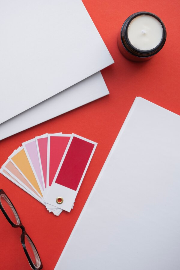
A single color rarely tells the whole story. The way colors combine—your palette—creates nuance and depth in brand perception.
1. Primary, secondary, and accent colors
Most brands define:
- Primary color(s): The core brand tone used in logo and main elements
- Secondary colors: Support colors that extend the system (backgrounds, infographics, patterns)
- Accent colors: Small pops used for emphasis (buttons, highlights, alerts)
For example, a brand may use:
- Navy (primary) → trust and professionalism
- Teal (secondary) → modern, fresh twist
- Coral (accent) → energy and friendliness in CTAs
The resulting perception: reliable but not boring; modern and human.
2. Color harmony and contrast
How colors sit together changes how each one is perceived:
- High contrast (e.g., black + yellow): Bold, loud, energetic
- Low contrast (e.g., pastels or analogous palettes): Calm, soft, subtle
- Monochrome (shades of one hue): Minimal, focused, often premium
Accessibility also matters: sufficient contrast is critical for legibility and usability, impacting how inclusive and professional a brand feels.
3. Temperature and saturation
- Warm palettes (reds, oranges, yellows): Energizing, social, extroverted
- Cool palettes (blues, greens, some purples): Calm, professional, introspective
- Highly saturated colors: Youthful, loud, bold, often digital‑native
- Desaturated/muted tones: Sophisticated, calm, “grown‑up,” sometimes niche/indie
Two brands could use “blue” yet feel completely different: electric cyan feels edgy and tech‑forward; dusty steel blue feels conservative and muted.
Audience, Culture, and Context
1. Demographic expectations
Age, gender, and lifestyle influence how colors are received:
- Younger audiences often tolerate or prefer more saturation and contrast.
- Older or more traditional audiences may respond better to stable, muted palettes.
- Gender associations with color are shifting; relying on stereotypes (e.g., “pink for women”) can feel outdated or alienating.
2. Cultural differences
Color meanings vary across cultures:
- Red: luck and celebration in many Asian cultures; danger/alert in many Western contexts.
- White: purity in Western weddings; mourning in some Eastern traditions.
Global brands often adapt palettes or at least emphasize different colors in different markets.
3. Category conventions
Every industry develops visual “codes”:
- Tech: blues, teals, purples, gradients, neon accents
- Organic food/eco: greens, browns, off‑whites
- Luxury: black, gold, deep jewel tones, minimal color
Following conventions helps users quickly recognize your category. Breaking them can differentiate you—but do it strategically so you don’t confuse or misposition your offer.
Strategic Steps to Choosing a Brand Palette
1. Start with brand strategy, not color swatches
Clarify:
- Who is your primary audience?
- What problem are you solving and how do you want to be perceived?
- Which three adjectives best describe your brand (e.g., bold, caring, innovative)?
- How do competitors look, and where do you want to sit relative to them?
Color should express these answers, not precede them.
2. Translate brand traits into color attributes
Map your adjectives to color qualities:
- “Trustworthy, established” → darker blues, muted neutrals
- “Playful, disruptive” → bright, warm accents, unexpected combinations
- “Sustainable, calming” → greens, soft blues, earthy neutrals
Then select a narrow set of candidate colors that plausibly align.
3. Build and test combinations
Create a small number of palette options and test them:
- Logo and wordmark
- Website homepage mock
- Social media posts
- App or product interface screens
- Packaging or signage (if applicable)
Look for:
- Consistency of feeling across touchpoints
- Readability and accessibility (especially text on backgrounds)
- Differentiation from direct competitors
Collect feedback from people resembling your target audience, not just internal teams.
4. Consider flexibility and scalability
Good brand palettes work across:
- Dark and light backgrounds
- Digital and print (CMYK vs RGB)
- Static and motion design
- Photography and illustration styles
A palette that looks great in a logo but fails in UI (buttons, alerts, states) will constrain you later.
5. Document and enforce
Once finalized, codify:
- Hex / RGB / CMYK / Pantone values
- Usage rules (when to use which color, what not to do)
- Minimum contrast ratios for text
- Examples of correct and incorrect implementations
Consistency over time is what turns color into a true brand asset.
Common Pitfalls in Color Use
- Choosing based on personal taste alone: The brand isn’t for you; it’s for your audience.
- Overloading on colors: Too many hues look chaotic and dilute recognition.
- Ignoring accessibility: Low contrast harms usability and can negatively affect trust and perceived quality.
- Copying competitors too closely: You’ll blend in and be harder to remember.
- Overreliance on stereotypes: “Blue for men, pink for women” or “green equals eco” without real substance can feel shallow.
Measuring the Impact of Color Choices
You can evaluate color decisions with both qualitative and quantitative methods:
- A/B tests: Different color variants for CTAs or landing pages to see impact on clicks or conversions.
- Brand perception surveys: Show different visual directions and ask respondents to rate them on traits (trustworthy, fun, premium, etc.).
- Brand recall studies: Measure which palettes are remembered more clearly after exposure.
- Usability testing: Observe how quickly users interact with key elements and whether colors guide behavior intuitively.
While color is only one part of the branding mix, misaligned color choices can quietly work against an otherwise strong strategy.
Conclusion
Color in branding is not decoration; it’s a psychological and strategic tool. Every hue and combination carries signals about what you stand for, who you serve, and how you should be perceived.
Effective palettes:
- Align with brand strategy and audience expectations
- Balance category recognition with distinctiveness
- Support usability and accessibility
- Remain consistent across touchpoints while allowing for flexibility
When chosen thoughtfully, color becomes one of the most powerful, efficient ways your brand speaks—often before a single word is read.